See previous pages here...
So here I am, back with another page from the scrapbook that captures moments from Valentine's Day. For this, I have used the same base PP as the previous page from Echo Park's This & That Graceful 12x12 collection... this one
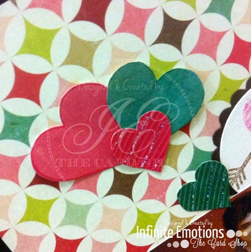
As this page was about Valentine's Day, I used a lot of lovey-dovey elements. I stamped and cut out some hearts on various pieces of PP. On some, I stamped a striped heart on the PP in a darker colour and added some stickles on alternate stripes.
I cut our three circles using the circle die and bordered that with a scalloped circle die and hid a part of these circles behind the photo and the journaling card.
I stamped heats and arrows on two circles and a paper-pieced owl on the one in the middle.
For the peeping scalloped circles, I was inspired by this sketch. It just turned it 90 degrees instead of using it as it is.. :)
I cut out a journaling card from Echo Parks's Sweer Girl collection.
Under the photo and journaling card, I added a scalloped border cut out from chocolate coloured cardstock. Under that layer I added a larger circle layered over a scalloped circle and spelled 'Valentines Day' (had to skip the apostrophe in Valentine's because the word wouldn't fit on the circle.)
Here's the complete page!! :)
See following pages here...
Here are the products used to make this page
I'll be back tomorrow with something new!!
Till then,
Ciao!
Love,
Nikita... :)


I like projects which do not include a gazillion elements. The PP, hearts and owls speaks volumes in this layout. Great job!
ReplyDeleteThank you, Somdeepa!! It requires mention that I was short on time when I made this and that's the reason there's not a lot going on. :P
DeleteAlso, as the background was pretty busy, too many elements would have made it look cluttered, so on that, I agree with you! :)